Please note: This article may contain affiliate links. All recommendations and styling advice are provided as helpful suggestions only, please always research thoroughly before making any major changes to your home.
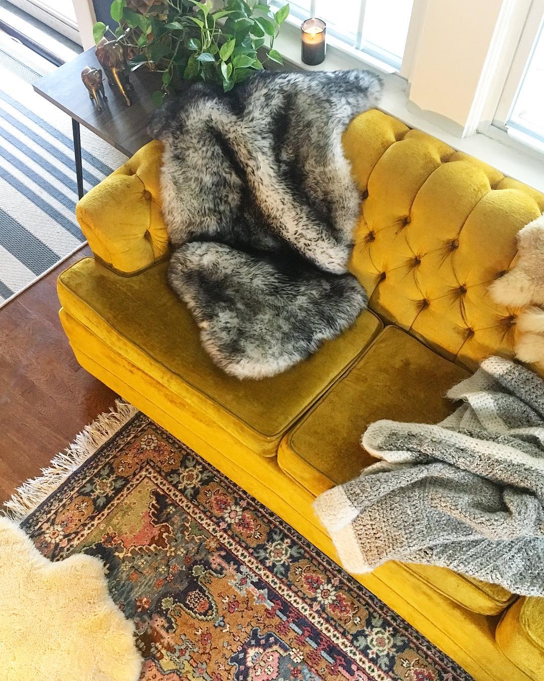
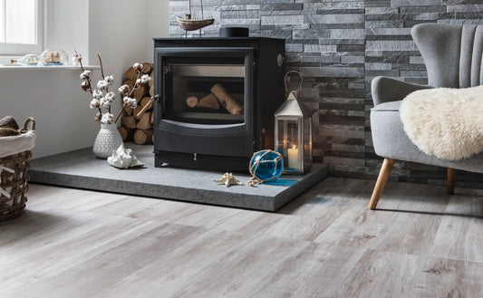
Photo credit: With permission from Danielle Newman via Instagram (@fleeting_interest) – note, with no interior design mistakes! It’s a beautifully designed space.
We've all been there: you're walking round IKEA or you've stumbled across a gorgeous piece of old furniture, and in your mind you say "...this is it! This will look perfect in my living room/kitchen/bedroom".
But, once you've half emptied your current account and got it home, it suddenly just doesn't... work. And that's because you've made an interior design mistake.
You're not alone. I used to do this a lot (and still do occasionally), and I suspect that even the best professional interior designers have been there too. But, it can help to know what these design mistakes are, if only to stop you from wasting hard-earned money on the wrong interior choices in future.
From pushing furniture out to the edges of the room, to tiny floating rug islands, here are five of the worst design mistakes you're probably making without even realising...

Photo credit: With permission from @aleshome via Instagram – white paint works beautifully as the perfect canvas to these stylish accessories – rather than trying to make the room appear larger. No design mistakes here.
1. Thinking White Paint Will Make a Room Bigger
White paint can be beautiful: from entire homes given over to white colour schemes to the occasional small hallway that needs brightening up, it truly does have transformative properties. But, what it can't do, is miraculously turn a small room into a big one.
Instead, white paint will reflect light and give the impression of there being more light available in the room. If it's brightness you're going for, then sure - opt for white. But if you want to give the illusion of more space? White paint won't really make your room look markedly larger. Instead, avoid a design mistake by choosing the paint colour that makes your heart sing, rather than the one you think the walls need. (Check out these beautiful hallways for inspiration, for example).
2. Tiny Floating Rug Islands
The second design mistake you see in homes across the land is the error of the 'tiny floating rug island'. That's where a rug sits in the middle of a space, with furniture approaching it but not quite touching it. This gives a 'floating island' effect, and what it actually does is make the room appear smaller, choppy and cheap. My current living room rug is doing this right now, and it's really annoying once you notice it!
So, the rule is this: your rug should be much larger than you first think, with your furniture sitting on top of it completely - with room to spare - or at the very least, 'kissing' it with its two front legs. That will mean having to shell out for a larger rug, but I promise it will work.
3. Pushing Furniture to Outside Edges
You're not alone in doing this - in fact, the 'waiting room effect' is common in homes across the country, and particularly in living rooms. This happens when people push their sofas, armchairs and other pieces of furniture up against the walls to allow more space in the centre. But unless you have small children to give plenty of play area to, this is a big design mistake.
Instead, bring your furniture in from the walls to allow each piece to have a little breathing space, and don't be afraid for people to see the back of your sofa. Of course, your furniture arrangement is going to depend on the size of your room, but even a small room can benefit from prying your furniture away from the walls a little. 
Photo credit: With permission from Lucinda Mitra via Instagram (@nest_twenty_eight) – the ladder and photographs staggered at different heights against this bold black wall vary the ‘skyline’ perfectly. No design mistakes here.
4. Not Varying the Skyline
Think of any room in your home as a city skyline. Are there lots of rises and falls and variation in the skyline, or does it all sit at one level? Having your furniture and accessories all sitting at one level is another design mistake to avoid - it's a bit boring, as even on a subconscious level isn't particularly stimulating. Instead, surprise and delight your mind with a variety of heights in the room.
Low sofas, high lamps - it's the contrast and unexpected juxtaposition that works well.
5. An Ineffective Gallery Wall
Whether you're displaying family photos or your collection of prints and posters, a gallery wall is often a great way to do it. But, done incorrectly, it can look messy, sparse or underwhelming. Avoid this design mistake by ensuring that you have one piece within your gallery that you hang everything around, anchoring the arrangement and giving your eye a focal point.
Then, read up on these lesser known gallery walls tips to really nail this interior design feature. Are you guilty of making any of these interior design mistakes? Let me know in the comments, and pin this for later (below).
Pin This for Later
